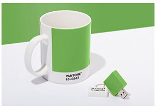
GREENERY – 2017 PANTONE COLOR OF THE YEAR
GREENERY PANTONE 15-0343
A refreshing and revitalizing shade, Greenery is symbolic of new beginnings.
Greenery is a fresh and zesty yellow-green shade that evokes the first days of spring when nature’s greens revive, restore and renew. Illustrative of flourishing foliage and the lushness of the great outdoors, the fortifying attributes of Greenery signals consumers to take a deep breath, oxygenate and reinvigorate.
Greenery is nature’s neutral. The more submerged people are in modern life, the greater their innate craving to immerse themselves in the physical beauty and inherent unity of the natural world. This shift is reflected by the proliferation of all things expressive of Greenery in daily lives through urban planning, architecture, lifestyle and design choices globally. A constant on the periphery, Greenery is now being pulled to the forefront – it is an omnipresent hue around the world.
A life-affirming shade, Greenery is also emblematic of the pursuit of personal passions and vitality.
What is the PANTONE Color of the Year?
A symbolic color selection; a color snapshot of what we see taking place in our global culture that serves as an expression of a mood and an attitude.
GREENERY COLOR PAIRINGS
Nature’s neutral, PANTONE Greenery is a versatile “trans-seasonal” shade that lends itself to many color combinations. As displayed in the 10 palettes below, Greenery is paired with neutrals, brights, deeper shades, pastels, metallics and even the enduring presence of PANTONE Color of the Year 2016, Rose Quartz and Serenity. These palettes easily cross over fashion, beauty, product and graphic design applications.
Resource: www.pantone.com


0 Responses to Post
Leave a comment